Introduction
As one of Enbridge’s internal operational tools, MEPA plays a vital role in helping the Control Centre Operations team manage electrical power usage across pump stations and regions to stay within utility contracts and avoid costly overages. The original system hadn’t evolved since the 1990s, burdened by outdated workflows, unintuitive design, and a heavy reliance on IT support.
MEPA 2.0 is a complete redesign aimed at transforming this legacy tool into a modern, self-serve platform, equipping users with more autonomy, clearer insights, and the flexibility to manage power limits at scale.
Project Context
TL;DR
MEPA 2.0 is a ground-up redesign of the Multi Environment Power Allowables system used by Enbridge to manage electrical power limits across pump stations, regions, utilities, and custom groupings. I led both product design and business analysis, collaborating with SMEs, developers, and product stakeholders.
My role included the following:
- Transform a 1990s-era tool into a modern, intuitive system
- Empower users to configure limits, groupings, and schedules without IT intervention
- Build a robust design system for easy prototyping and seamless dev handoff
- Introduce automation, visual hierarchy, and system-wide visibility
The project is ongoing, but early outcomes already show major improvements in user autonomy, error reduction, and system clarity.
Project Context
The original MEPA tool played a critical role at Enbridge, helping the Control Centre Operations team enforce power usage contracts across the company’s massive infrastructure. However, the system hadn’t been updated in decades, its workflows were clunky, information hierarchy dated, and many actions required IT tickets and manual effort.
The client initiated MEPA 2.0 to:
- Create a future-ready, modern interface that matched users’ mental models
- Reduce reliance on scarce internal OT developers
- Improve accuracy and efficiency by integrating with other systems
- Enable automation for faster, more responsive power management
- Create a future-ready, modern interface that matched users’ mental models
- Reduce reliance on scarce internal OT developers
- Improve accuracy and efficiency by integrating with other systems
- Enable automation for faster, more responsive power management

Legacy MEPA Screen
My Role
As the lead product designer and business analyst, I wore multiple hats to ensure the success of MEPA 2.0.
My contributions included:
- Facilitating workshops with SMEs and operators to uncover current workflows, pain points, and needs
- Leading UX research, user interviews, and contextual inquiries (e.g., “day-in-the-life” studies)
- Designing the entire interface, building the design system, and prototyping workflows
- Collaborating with developers to ensure smooth translation from design to implementation
- Acting as a bridge between engineering and business, using my background in both fields to translate complex technical requirements into accessible user flows
Example Feature Review from Workshop
User Needs & Research
Primary Users:
- Energy Optimization Team – Works with utility providers to negotiate power contracts and set allowable consumption thresholds
- Operators – Monitor and adjust usage at pump stations based on MEPA inputs
- Energy Optimization Team – Works with utility providers to negotiate power contracts and set allowable consumption thresholds
- Operators – Monitor and adjust usage at pump stations based on MEPA inputs
Research Activities:
- Shadowing and day-in-the-life sessions to understand current workflows
- Workshops to review legacy pain points and co-design features
- Usability testing via Figma and Microsoft Teams with Copilot summarizing feedback
- Technical research into OT environment constraints, UI frameworks, and SCADA/ISO/ASM requirements
Key Pain Points Identified:
- Grouping changes required months of IT intervention
- Legacy interface was difficult to navigate and prone to user error
- Manual data entry and lack of system integration led to inefficiencies and inconsistencies
- No system-wide view of consumption or real-time feedback
- Grouping changes required months of IT intervention
- Legacy interface was difficult to navigate and prone to user error
- Manual data entry and lack of system integration led to inefficiencies and inconsistencies
- No system-wide view of consumption or real-time feedback

MEPA 2 Personas

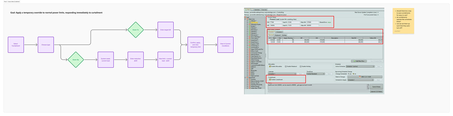
Set Demand Work Flow
Design Approach
I used a lean, iterative design approach rooted in collaboration. Each feature cycle included co-definition with SMEs, rapid prototyping in Figma, recorded testing with end-users, and refinement based on feedback—all while syncing with developers to ensure feasibility and alignment with Enbridge’s tech environment.
Design Priorities:
- Clear information hierarchy and visual clarity
- Simplified, linear workflows aligned to mental models
- High scanability and minimal cognitive load
- User freedom and autonomy without requiring backend support
- Clear information hierarchy and visual clarity
- Simplified, linear workflows aligned to mental models
- High scanability and minimal cognitive load
- User freedom and autonomy without requiring backend support
Notable Design Enhancements:
- Color-coded power feedback and alarms for rapid awareness
- User-managed groupings replacing hardcoded IT-created sets
- Streamlined scheduling tool with intuitive layout, local time support, and all key data in one view
- Tabbed navigation for toggling between utility and grouping workflows
- Breadcrumbs and contextual feedback to improve navigation
- Enhanced comments with timestamps and authorship for team communication
- Automation via integration with Optimus for pump-based limits
- Curtailment logic for emergency demand reduction based on utility provider input
- Dashboard view for compliance monitoring, usage comparison, and filtering
- Changelog to monitor adjustment and understand historical usage patterns
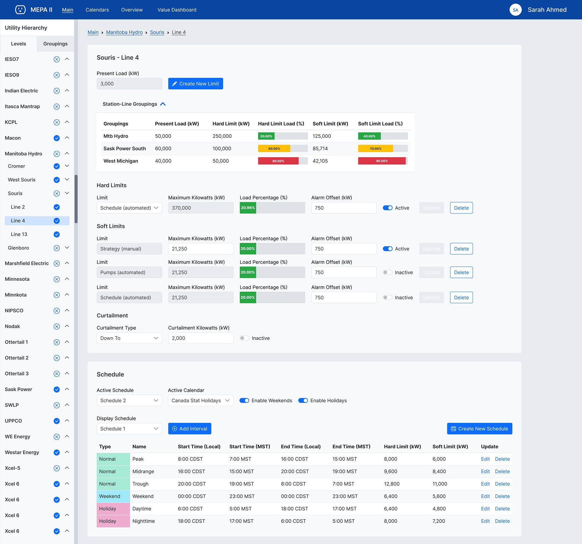
UI for Setting Limits with Colour-Coded Alarms and Schedule

Example Prototype for User Testing and Validation
Impact & Outcomes
Although MEPA 2.0 is still in progress, we’ve already seen meaningful improvements:
- Grouping updates reduced from months to minutes, now fully user-managed
- Improved performance through more efficient architecture
- Error reduction via timezone handling and smarter forms
- System-wide visibility through redesigned overview and dashboard tools
- Reduced manual entry through integrations and background logic
- Operator autonomy through features like curtailment and real-time feedback
- IT relief, fewer support tickets and less reliance on niche OT developers

Overview Screen Before and After
Artifacts & Visuals
To support fast iteration, dev alignment, and traceability, I created a comprehensive suite of design assets and documentation:
- Figma Design System built on Bootstrap 5 for rapid prototyping and dev readiness
- Feature-level mockups with mapped user stories and workflows
- Annotated legacy screens to capture user feedback and pain points
- Workflow diagrams showing how MEPA 2.0 improves linearity and reduces cognitive load
- Research documents including ASM, ISO, and SCADA environment considerations
- Personas and journey maps for Energy Optimization and Operator roles
- Testing sessions recorded and analyzed with Copilot to summarize insights
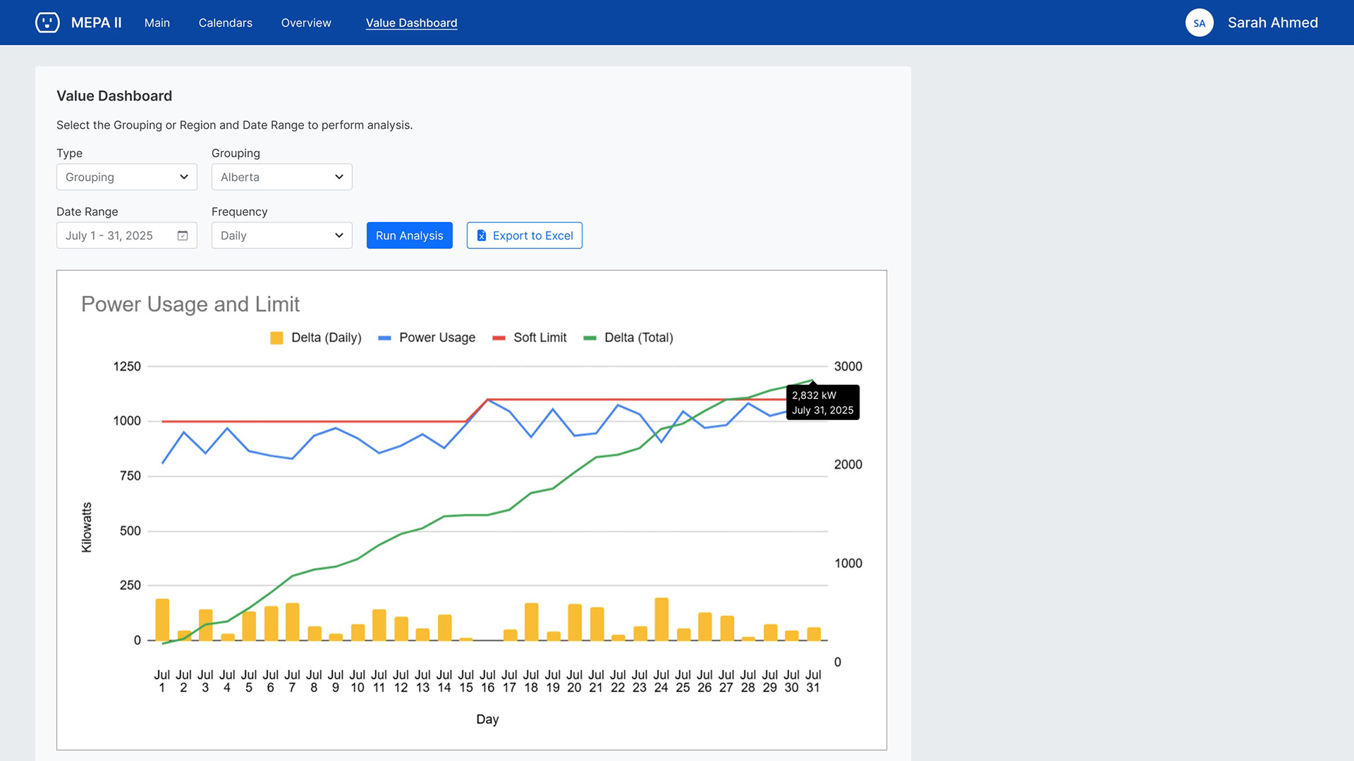
Value Dashboard Concept
Conclusion
MEPA 2.0 demonstrates how thoughtful product design, grounded in research, collaboration, and systems thinking, can turn a dated legacy tool into a modern, flexible, and user-friendly system. It’s a deep, technical product, but also a great example of applying design to untangle complexity and return power (literally and metaphorically) to the user.